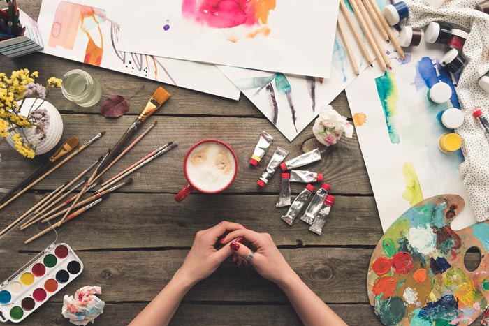
Acrylic paint is a new medium in the art world compared to traditional oil paints and watercolors. Its versatility, flexibility, durability, vibrancy, and stability are some of the many reasons why more artists tend to approach and use this paint. The different varieties of acrylic mediums are greater compared to other mediums as well. Its fast-drying feature also allows the artist lesser time to wait in between layers.
Artists that commission paintings do not need to wait a lot of time and can usually ship out their paintings a day after. Toxic spirits are not even required since artists can just use water to thin out the paint. It is even safe to paint around kids and pets when using acrylic – since it does not contain toxins that may be harmful to one’s health.
However, there are a few problems that artists may encounter when dealing with acrylic paints. Have a look at this list and the explanation below.
- Fast drying – This means no wet in wet technique
- Not as highly valued by professionals
- Harder to clean brushes after use
Acrylic paintings for one is not highly valued compared with other paint mediums in galleries or art collectors. Since acrylic paints are fast-drying, artists need to work quickly. Artists cannot easily blend and use the wet in wet’ technique that is usually done in oil painting. When these paints dry it is impossible to remove or alter if there are tiny details you are not satisfied with. The only thing you can do is paint a new layer on top.
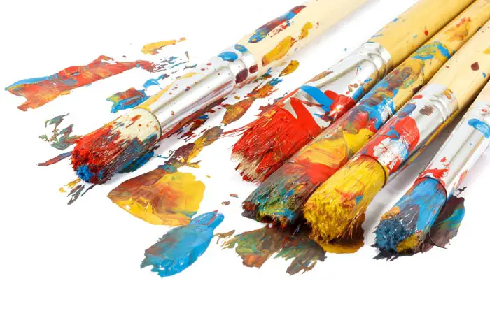
Removing the acrylic paints from brushes, nails, and clothing is hard when dried. Make sure to have protective clothing to avoid ruining your garments. The colors may also change darker when it’s dry well, so the color the artist initially used might not be what he ends up with.
So to avoid that, there are several tips and tricks to remember to ensure that you end up with a vibrant painting if that’s what you’re going for.
Table of Contents
Cheap vs expensive acrylic paints
To end up with a vibrant shade, the most important step is to start with saturated shades first. Go for more modern pigments since those colors tend to be more vibrant than traditional ones. Avoid using those student grade paints and opt for the more professional quality of acrylics.
The outcome of your painting will always depend on the quality of the mediums you used. Beginners often hesitate to invest in professional quality paints. However, your progress as a painter is greatly affected by the tools you are using. There is a contrast between the professional and student quality paint that you may use as a reference so that it can help you understand the color theories and information needed easier.
Professional quality paints have a significantly higher pigment level and have the most variety of colors. However, you may find that different prices depend on branding. Student quality paints on the other hand have less paint coverage and are better for larger-scale paintings. This paint has a more affordable price range compared to the latter. But these types of paints are usually cheap for a good reason. This may cost you less but may cost you your time at the studio as well. Cheaper paints usually entail less pigment, more binders, and fillers which would result in much lesser vibrant paint.
Well in general, student quality and artist quality are the two grades of quality paint. Artist graded paints are usually a better quality because they have more pigments compared to a student grade quality paint hence making it a tad bit more expensive. It also makes it cleaner and the colors are purer when mixing. However, student grade quality paint has its strengths as well. They are just usually made from the same pigments just lesser quantities. Keeping in mind the performance of each product, the difference between the manufacturer and the grade quality of the product would truly affect your piece of art. It is up to your preference on which quality paint you should buy and or invest in. But, you also have the choice to mix different types of paints from different manufacturers. Although they may have different formulations, the chemical foundation between each paint is the same, making it compatible with each other.
Matte vs Glossy Surface
Lets go over a few more important things to consider. First lets have a look at a brief list and then we will go on to have a look at each point in more detail.
- Matte vs glossy surface
- Working transparently
- Use of white and black
- Effect of bright white surfaces on acrylic color
- Effect of natural grey on the vibrance of acrylic paint
The result and vibrancy of your art are also affected by the surface you paint it on. Matte surfaces can affect the result and may make it less vibrant compared to a glossy one.
Mixing some gloss glazing medium can help bring back the vibrancy of the colors and will give a nice outcome to your painting. You can also choose to wait until you finish the painting and add the glossy medium on top to bring it back to life. However, it may produce a glare that some artists do not like or prefer. If you are one of those artists, you can choose to add a satin finish varnish to remove the glare off the surface of your painting.
Some varnishes are removable that you can use so that it would be easier to adjust and clean after if need be. Better to experiment with mixing or layering with paints first just so you can see what style and finish you would prefer since artists have different styles and preferences when it comes to art. Also keep in mind that if you want to photograph your painting, best do it before you take a photo since it may produce glare when using a flash and make it difficult to give justice to the painting.
Working Transparently with acrylic paint
Depending on using white to lighten the shades are usually one of the main reasons why acrylic paints appear dull. Mixing white to make the shade appear lighter lessens its intensity and makes it appear pastel which is the opposite of a high vibrancy so avoiding whites to lighten is a must.
Artists that use watercolors as a medium often steer clear of white when lightening a color. Its transparency is usually one of the main reasons why watercolors are vibrant. White just lessen the saturation of color hence making it appear dull.
There are acrylic mediums specifically made for lightening acrylic paints. It can make your paint more transparent when using this instead of mixing water that may weaken the paint film. This is called glazing and can add depth to your paintings.
When to use White and Black
Knowing when to use and add white or black shade to your palette is a good way to avoid making your paintings look dull. Learning when to introduce and add white to your painting to produce brilliant and bright colors is extremely important.
You can use white instead to paint the brightest highlights or use it to paint over mistakes. Like white, black shades can also make your colors appear dull or dark when you use too much. If that happens, it may be because you are relying on too much black to darken your colors. Instead of using black, opt to use the complementary shade to make darker a color.
How Bright White Surfaces effect the Colors
Incorporating transparent colors also demands to have a bright white surface for it to work. Transparent paintings rely on the white canvas to reflect the light and make it appear more saturated and less dull.
The color of the surface you paint affects the brightness, vibrancy, and mood of your output. Priming your canvas with a bright white gesso is a must if you are looking for a vibrant and bright result. If you want a darker vibe for your painting opts for a greyish tint to prime your canvas in.
Neutral Grays help Vibrancy
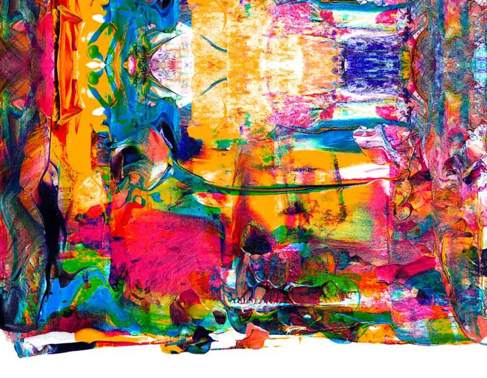
Overdoing is easy when you have a lot of ways to make the shade appear more vibrant. Try to avoid using saturated colors all over your painting. Take advantage of the neutral gray tones to balance and highlight the important features of your art piece. If you use too many saturated colors it would look too busy and nothing will stand out. Every shade and colors used can influence the hues surrounding it.
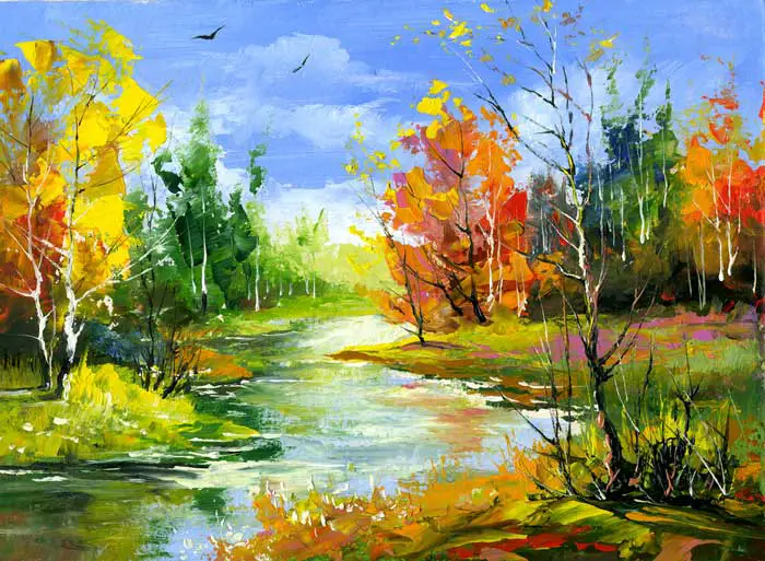
Reserve the most vibrant and saturated colors to make up the focal point of your painting and make it stand out. There are several tips on how to make sure that you have a vibrant and beautiful painting. Just keep in mind that investing in a good quality or professional grade quality of acrylics can make your painting experience easier. However, there is also nothing wrong with using cheaper and student grade quality acrylics if you do prefer it.
Art is an expression of oneself and there is no right or wrong when it comes to producing an art piece. Taking the time to learn about color theory is also a good way to improve the overall look of your painting since using whites and blacks can affect the saturation and vibrancy of the shades. Having a deeper understanding of color theories probably has the biggest impact on the result of your painting. Just take the time to learn your preference and your art style.
